MSCHF Internet Studios: Times Newer Roman
Published in C Magazine, issue 141 (Spring 2019)
Times New Roman was created in 1932 as part of a redesign of The Times —a British daily newspaper based in London—and is attributed to Stanley Morison. An autodidactic scholar-designer, Morison had published widely on the history of typography. He was a member of a circle of artists and small-press printers who sought to revive Arts and Crafts ideals in the graphic arts. Times New Roman would later go on to become ubiquitous, used for legal briefs, magazines and encyclopedias. In the late 20th century, the proliferation of personal computers in homes and offices across an increasingly networked world established Times New Roman as the de facto typographic voice of administrative authority.
When the redesign commenced in 1929, The Times’ circulation was small but well connected, as the paper was a long-time champion of empire and was widely read by its administrative class. Morison and the management decided to create a new typeface. With Victor Lardent from the paper’s advertising department, Morison was to produce something close to Monotype’s Plantin, but with cupped serifs similar to those used in Baskerville. The result, Times New Roman—in contradistinction to Times Old Roman, the Victorian typeface previously employed—was considered by designers at the time to be a very legible type. Times New Roman’s chief virtue, however, was its economy; it allowed the newspaper to cram more words onto a page.
Times New Roman was a typeface whose every quirk and eccentricity was suppressed—its skeleton was meant to appeal to the traditional sensibilities of an establishment eye, nostalgic for the past glories of Georgian England. The finish, however, had, in Morison’s convoluted phrasing, “the merit of not looking as if it had been designed by somebody in particular.” Morison’s aim with the typeface was that no one would notice the changeover. It worked, and it affirmed Morison’s doctrine, which Robin Kinross called the “hegemony of invisibility.” (It’s no accident that Morison’s friend and colleague, the brilliant writer and scholar of typography Beatrice Warde, famously called for typographic design to be invisible in an address to the British Typographers’ Guild at the St Bride Foundation Institute the same year the typeface was introduced.) This approach had a reader-centric ethic, as it emphasized a comfortable reading experience, but it also gave The Times a feeling of authority without a centre. The typeface was the perfect summation of bland, invisible power.
In the years after its commercial release in 1933, Times New Roman’s spatial efficiency made it a very popular typeface, but its total world domination really began with personal computing. Microsoft licensed the type in 1990, and it was set as the default for many Windows applications for the next 20 years. In 1994, Adobe licensed Times New Roman from Linotype as part of its updated PostScript language, along with Helvetica, Courier and Symbol; PostScript would become the lingua franca protocol for describing the appearance of a page for digital printing. Times New Roman’s early adoption meant that as desktop computers began to proliferate, it became a standard for all types of communication.
Times New Roman was designed to sink into the soft paper that The Times used in 1932; the slight squish of the type into this paper thickened its sharp serifs and strengthened its thin strokes. As a result, Times New Roman looked disappointing on the smooth, thinner stock The Times switched to in 1956. The newspaper eventually abandoned Times New Roman in 1972. Since then, the typeface has been slowly falling out of use by governments, law offices and designers. It also doesn’t work well on screens because, when it was digitized, this “soft paper” effect wasn’t built into the outlines. The digital version was just a little too high contrast. Microsoft replaced it with Calibri in Word in 2007, though its fellow core typeface Helvetica has proven to be a better fit for digital environments and has fared better. Academia is the safe, high point on Times New Roman’s otherwise eroding island.
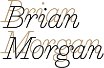
Times Newer Roman (2018) was created by MSCHF Internet Studios, which refers to its storytelling medium as “internet,” and is also responsible for software interventions like Tabagotchi, a Chrome app with a little creature that dies if you open too many tabs in your browser. MSCHF took Nimbus—a later, German knock-off of Times New Roman—and redrew it. The result looks like the original but is deliberately less efficient: a 15-page document set in Times Newer Roman will contain 15 percent fewer words than if it was set in Times New Roman, thus allowing slackers to turn in shorter school papers. MSCHF released the font for free in September 2018, and more than 5,000 copies were downloaded on the first day alone.
What makes Times Newer Roman a brilliant move is that as a stroke, it repudiates two of the original’s key attributes: it’s intentionally inefficient, and by creating a lookalike, it challenges the status and integrity of Times New Roman as a standard. This breaking of the spell of Times New Roman was long overdue. Times New Roman is an example of an old technology that no one has properly renewed for the current age. Its attributes, developed for a specific physical environment, aren’t optimized for present-day digital environments. In the last 30 years, type designers have created scores of versatile typefaces for digital and mixed environments.
There is also the question of the tone that Times New Roman lends to a text. No font is neutral. As Aleida Assmann points out, “power needs origins.” Times New Roman presents us with a lineage that draws from British imperial identity, which its bland shroud largely conceals. Users—designers, desktop publishers, office workers—take what typeface designers give them and develop their own associations, which become reinforced by practice. Times New Roman would seem an odd and cold choice for a birthday card, but not for an eviction notice, for example. A similar process happened with Helvetica—it was used for everything that the International Typographic Style (aka, the Swiss Style) stood for: modern, progressive, neutral and universal. Times New Roman, on the other hand, was the font of choice for dull writing: it was Helvetica’s grey, administrative cousin. Ubiquity implies standards, norms and stability.
The authority of print is real, but thankfully this authority cuts more than one way: as Jack Goody observed, it can strengthen princes, but also organize dissent—in this case, giving academic writers a bit of leeway within the shackles of word counts. For any piece submitted in Microsoft Word, however, the substitution would be obvious at once: unless the recipient already has Times Newer Roman installed on their computer, and is hence in on the joke, the type would be substituted with (most likely) Cambria. One can only dream, therefore—or use PDFs and hard copies.

Courtesy C Magazine